
Data Analysis with R
9 - Intro2Visualization - Adjusting plots
Saskia A. Otto
Postdoctoral Researcher
From default to custom
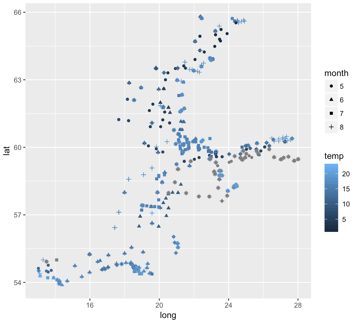
Explore spatial patterns of summer sea surface temperature in the Baltic Sea graphically:
How to get from left to right?
Before you get there ...recap ...
Creating plots in a stepwise process
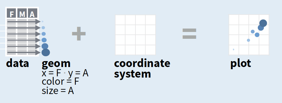
- Start with
ggplot(data, mapping = aes())where you supply a dataset and (default) aesthetic mapping - Add a layer by calling a
geom_function - Then add on (not required as defaults supplied)
- scales like
xlim() - faceting like
facet_wrap() - coordinate systems like
coord_flip() - themes like
theme_bw()
- scales like
- Save a plot to disk with
ggsave()
source of image (topright): older version of Data Visualization with ggplot cheat sheet (licensed under CC-BY-SA)
You will now learn how to override the default settings
p <- ggplot(hydro, aes(long, lat))
str(p)

ggplot - Aesthetics
ggplot(data, aes(x, y, color, size, shape, linetype, fill, alpha, label, family, width, hjust, vjust, ...))
Aesthetics: visual properties of the objects in your plot
- You can display a point in different ways by changing the values of its aesthetics (e.g. size, shape, and colour of border and inside):

- Use
aes()to associate the name of the aesthetic with a variable to display, for single valuesaes()not needed - Once you map an aesthetic, ggplot2 takes care of the rest:
- selects a reasonable scale
- constructs a legend that explains the mapping between levels and values
- For x and y aesthetics, ggplot2 does not create a legend, but it creates an axis line with tick marks and a label
Assign single value for aesthethic colour (aes() not needed):
ggplot(hydro_april, aes(long, lat)) +
  geom_point(colour = "red")

Assign single value for aesthethic colour (aes() not needed):
ggplot(hydro_april, aes(long, lat)) +
  geom_point(colour = "red")

Map colour to variable "day" with automatic colour setting:
ggplot(hydro_april, aes(long, lat)) +
  geom_point(aes(colour = factor(day)))

Note:
If you don't like the default settings, you need to add a scale function later.Colour
Colour is the most popular aesthetic after position. It is also the easiest to misuse.
It can be specified with
- A name, e.g., "red". R has 657 built-in named colours, which can be listed with
colours(). - An RGB specification, with a string of the form "#RRGGBB"
- The Stowers Institute provides a nice printable pdf that lists all colours.
Colour
Colour is the most popular aesthetic after position. It is also the easiest to misuse.
It can be specified with
- A name, e.g., "red". R has 657 built-in named colours, which can be listed with
colours(). - An RGB specification, with a string of the form "#RRGGBB"
- The Stowers Institute provides a nice printable pdf that lists all colours.
col_df <- data.frame(x = 1:4, y = 1:4)
ggplot(col_df, aes(x, y)) +
  geom_point(colour = c("blue4",
    "grey60", "#556B2F", "#8B7355"),
    size = 7)

Note:
Only single values are assigned to the colour aesthethic, hence, the `aes()` mapping (to a variable) is not needed.Colour (cont)
For some geoms/point shapes you can specify 2 colour aesthetics: the border colour (=colour) and the inside (=fill)
ggplot(hydro, aes(x = fmonth)) +
  geom_bar(aes(colour = fmonth), fill = "white")

Colour (cont)
To make colours transparent use alpha aesthethics
- range from 0 = transparent to 1 = opaque
col_df <- data.frame(x = 1:5, y = 1:5)
ggplot(col_df, aes(x, y)) +
  geom_point(fill = "red",
    alpha = c(.1,.3,.5,.7,1.0),
    size = 5, shape = 21)

Types of shape
Default shape is 19
shapes <- data.frame(
  shape = c(0:19, 22, 21, 24, 23, 20),
  x = 0:24 %/% 5, y = -(0:24 %% 5))

ggplot(shapes, aes(x, y)) +
  geom_point(aes(shape = shape),
    size = 10, fill = "red") +
  geom_text(aes(label = shape),
    hjust = 0, nudge_x = 0.15) +
  scale_shape_identity() +
  expand_limits(x = 4.1) +
  scale_x_continuous(NULL,breaks=NULL) +
  scale_y_continuous(NULL,breaks=NULL)

Linetype
Line types can be specified with an integer or name: 0 = blank, 1 = solid, 2 = dashed, 3 = dotted, 4 = dotdash, 5 = longdash, 6 = twodash, as shown below:
lty <- c("blank", "solid", "dashed",
  "dotted", "dotdash",
  "longdash","twodash")
linetypes <- data.frame(
  y = seq_along(lty), lty = lty)
ggplot(linetypes, aes(0, y)) +
  geom_segment(aes(xend = 5,
    yend = y, linetype = lty)) +
  scale_linetype_identity() +
  geom_text(aes(label = lty),
    hjust = 0, nudge_y = 0.2) +
  scale_x_continuous(NULL,breaks=NULL) +
  scale_y_continuous(NULL,breaks=NULL)

Text - Font
There are only three fonts that are guaranteed to work everywhere: "sans" (the default), "serif", or "mono":
df <- data.frame(x = 1, y = 3:1,
  family = c("sans", "serif", "mono"))
ggplot(df, aes(x, y)) +
  geom_text(aes(label = family,
    family = family), size = 15)

Text - Justification
Horizontal and vertical justification have the same parameterisation, either a string (“top”, “middle”, “bottom”, “left”, “center”, “right”) or a number between 0 and 1:
- top = 1, middle = 0.5, bottom = 0
- left = 0, center = 0.5, right = 1
just <- expand.grid(hjust = c(0,0.5,1),
  vjust = c(0, 0.5, 1))
just$label <- paste0(just$hjust, ", ",
  just$vjust)

ggplot(just, aes(hjust, vjust)) +
  geom_point(colour = "grey70",
    size = 5) +
  geom_text(aes(label = label,
    hjust = hjust, vjust = vjust),
    size = 7)

Your turn
Exercise 1: Aesthetics
- What happens if you map the same variable to multiple aesthetics?
- What does the stroke aesthetic do? What shapes does it work with? (Hint: use
?geom_point) - What happens if you map an aesthetic to something other than a variable name, like
aes(colour = psal < 10)? - What’s gone wrong with this code? Why are the points not blue?
ggplot(data = hydro) +
  geom_point(mapping = aes(x = psal, y = temp, color = "blue"))
ggplot - Scales
Using scales
- To change the default settings of an aesthetic use a scale that applies to that mapping (if you have used
aes()for a specific aesthetic):- aesthetic mapping = What variable to map to e.g. colour
- scale = How to map the variable to e.g. color
- Use the three part scale name convention and set additional arguments in the scale function if desired:

Common scales
Use with most aesthetics
scale_aesthetic ...
- _manual()
- _identity()
- _discrete()
- _continuous()
Use with x or y aesthetics
scale_x_log10()- Plot x on log10 scalescale_x_reverse()- Reverse axis directionscale_x_sqrt()- Plot x on square root scale
Scale colour - discrete data
ggplot2's default discrete palettes (depends on how many colors are needed)

Scale colour - discrete data
Example of oceanographic stations sampled in summer months
sst_sum <- hydro %>% filter(pres == 1, fmonth %in% 5:8)
sst_sum$fmonth <- factor(sst_sum$fmonth) # to remove other factor levels
p <- ggplot(sst_sum, aes(x = long, y = lat, colour = fmonth)) + geom_point()
Manually assign colours: scale_colour_manual()

p

p + scale_colour_manual(values =
  c("red","blue","grey30","green3"))
Use ready-made schemes: scale_colour_hue()
scale_colour_hue is the default colour scale → does not generate colour-blind safe palettes

p + scale_colour_hue()

p + scale_colour_hue(l = 50, c = 150,
  h = c(150, 270) )
Adjust:
luminosity, chroma, and range of huesUse ready-made schemes: scale_colour_grey()

p + scale_colour_grey()
Use ready-made schemes: scale_colour_brewer()

p + scale_colour_brewer()
The brewer scales provides nice colour schemes from the ColorBrewer particularly tailored for maps: http://colorbrewer2.org
To see a list of each brewer palette, run the following command
library(RColorBrewer)
display.brewer.all()

Scale colour - continous data
Example of summer sea surface temperature (SST)
# Same dataset as before
sst_sum <- hydro %>% filter(pres == 1, fmonth %in% 5:8)
sst_sum$fmonth <- factor(sst_sum$fmonth)
p <- ggplot(sst_sum, aes(x = long, y = lat, colour = temp)) + geom_point()
Use different gradient schemes: scale_colour_gradient()
scale_colour_gradient is the default colour scale. Creates a two colour gradient (low-high):

p

p + scale_colour_gradient()
Use different gradient schemes: scale_colour_gradient()
Change a few settings ...

p + scale_colour_gradient(
  low = "yellow", high = "red")

p + scale_colour_gradient(
  low = "white", high = "maroon4",
  na.value = "yellow")
Use different gradient schemes: scale_colour_gradient2()
Creates a diverging colour gradient (low-mid-high):

p + scale_colour_gradient2(midpoint=10)
Set the midpoint from 0 to 10.

p + scale_colour_gradient2(midpoint=15,
  low = "blue", mid = "yellow",
  high = "red", na.value = "black")
Overview of colour-related scales

Scale shape - discrete data
Scale shape - discrete data

p <- ggplot(sst_sum, aes(long,lat)) +
  geom_point(aes(shape = fmonth))

p + scale_shape_manual(values = 0:3)
Scale shape - discrete data

p <- ggplot(sst_sum, aes(long,lat)) +
  geom_point(aes(shape = fmonth))

p + scale_shape_manual(values = 0:3)
Note:
With different shapes it becomes more apparent that some stations were sampled in several months!Scale shape - continuous data
Scale shape - continuous data
When your data variable already contains values that could be used as aesthetic values ggplot2 handles them directly without producing a legend (the variable is considered as scaled).
Use scale_shape_identity() for continuous data:
ggplot(hydro_april, aes(long, lat)) +
  geom_point(aes(shape = day)) +
  scale_shape_identity()

Scale size - continuous data
Example of sea surface temperature (SST) in June
sst_june <- hydro %>% filter(pres == 1, fmonth == "6")
Scale size - continuous data
You can use scale_size(), scale_size_area(), or scale_radius():

p <- ggplot(sst_june, aes(long,lat))+
  geom_point(aes(size = temp),
    colour = "orange2", alpha=0.3)

p + scale_radius(range=c(1,10),
    breaks=seq(5,20,2.5), limits=c(4,20))
Note:
Using transparent colours (with alpha aesthetics) shows also nicely overlying points!There are scales for every aesthetic ggplot2 uses. To see a complete list with examples, visit http://docs.ggplot2.org/current

Screenshot from webpage (taken Dec. 2017)
Your turn...
Exercise 2: Scaling
Look at display.brewer.all()in the RColorbrewer package. Experiment with the different palettes available for the brewer scale. Add a color scheme that you like for temp in the sst_sum data.
ggplot - Faceting
Facets divide a plot into subplots based on the values of one or more discrete variables

To adjust facet labels set labeller
p + facet_grid(pres ~ fmonth, labeller = label_both)

Your turn
Exercise 3: Faceting
- What happens if you facet on a continuous variable?
- What are the advantages to using faceting instead of the colour aesthetic? What are the disadvantages? How might the balance change if you had a larger dataset?
- When using
facet_grid()you should usually put the variable with more unique levels in the columns. Why? - Read
?facet_wrap. What does nrow do? What does ncol do? What other options control the layout of the individual panels? Why doesn’tfacet_grid()have nrow and ncol argument?
5.What plots are generated by the following code? What does . do?
temp_sum <- hydro %>% filter(pres %in% c(1, 50), fmonth %in% 5:8)

ggplot(data = temp_sum) +
  geom_point(mapping = aes(x = long, y = lat)) +
  facet_grid(fmonth ~ .)

ggplot(data = temp_sum) +
  geom_point(mapping = aes(x = long, y = lat)) +
  facet_grid(. ~ pres)
ggplot - Coordinate systems
Using coordinate systems
- Determine the coordinate plane to draw the graph on.
- Use the two part scale name convention and set additional arguments in the coord_function if desired:

Which months are most frequently sampled?

Useful changes of coord: Pie charts
In the grammar of graphics, a pie chart is a stacked bar graph in polar coordinates.
monthly_pie <- hydro %>%
  select(fmonth, station, cruise,
    date_time) %>% distinct() %>%
  group_by(fmonth) %>%
  mutate(year = "y")

ggplot(monthly_pie, aes(year)) +
  geom_bar(aes(fill = fmonth)) +
  scale_fill_brewer(
    palette="Paired") +
  coord_polar(theta="y", direction=-1)
What is now needed is some element cleaning...

Useful changes of coord: Map projections
coord_map() projects a portion of the earth, which is approximately spherical, onto a flat 2D plane using any projection defined by the mapproj package.

# Showing the world map:
world <- map_data("world")
worldmap <- ggplot(world, aes(
    x=long, y=lat, group=group)) +
  geom_polygon(fill = "white",
    colour = "black")
worldmap + coord_map("ortho",
  orientation = c(55, 20, 0))

Zooming into the Baltic Sea:
Simply add the axis limits to coord_map()
worldmap + coord_map("ortho",
  orientation = c(55, 20, 0),
  xlim = c(10, 30), ylim = c(54,66))

Your turn...
Exercise 4: Coordinate systems
- Figure out out to change the order of the month in the flipped coordinate system (lower left plot in the overview figure)
- Turn a stacked bar chart into a pie chart using coord_polar().
- What’s the difference between
coord_map()andcoord_quickmap()?
ggplot - Making your figures look nice: labels, legends, and themes
Labels
- Good labels are critical for making your plots understandable to a wider audience.
- Both axis and legend labels should show the full variable name or a commonly used abbreviation.
- The title and subtitle should provide main findings.
Labels
- Good labels are critical for making your plots understandable to a wider audience.
- Both axis and legend labels should show the full variable name or a commonly used abbreviation.
The title and subtitle should provide main findings.
There are different functions available to change labels:
xlab(): change the label of the x-axisylab(): change the label of the y-axisggtitle(): provide a title (and subtitle)labs(): change all labels
Example with sea surface temperature in June

p <- ggplot(sst_june, aes(long,lat)) +
  geom_point(aes(colour = temp)) +
  scale_colour_gradient(
    low = "white", high = "red")

# Labels added here
p + xlab("Longitude") +
  ylab("Latitude") +
  ggtitle(label = "Thermal patterns
    in the Baltic Sea",
    subtitle = "Sea surface temperature
    (1m depth) in June 2015")
Legends
- Control over the legends is decentralized:
- Choose the type of legend for each aesthetic with
guides() - Make adjustments to the legend with
guide_legend()orguide_colourbar(), which can be specified in each scale_* function or inguides():
- Choose the type of legend for each aesthetic with

Example with sea surface temperature in summer
p <- ggplot(sst_sum, aes(long,lat)) +
  geom_point(aes(colour = temp,
    shape = fmonth)) +
  scale_colour_gradient(
    low = "white", high = "red")
p2 <- p + guides(colour =
      guide_colourbar(order = 1,
        title = "SST (in °C)"),
    shape = guide_legend(
      order = 2,
      title = "Summer months",
      title.position = "bottom",
      nrow = 2, byrow = TRUE,
      title.theme = element_text(
        colour = "red", angle = 0)))


Not happy with the labels?
Not happy with the labels?
You can change the labels (and more) in the scale_*_functions:
p3 <- p2 + scale_shape_discrete(
    labels=c("May","June","July","Aug"))
p3

Not happy with the position of the legend?
→ Lets get to the last topic ...
Themes
Themes
- A theme determines how the plot looks.
- ggplot2 comes with several pre-loaded themes that control the appearance of non-data elements.
- Customization → You can modify individual details of the current theme with
theme()or even create your own theme.
Change the legend position with theme()
p3 + theme(legend.position = "bottom",
  legend.justification = "left")

p3 + theme(
  legend.position = c(0.01, .95),
  legend.justification = c("left", "top"),
  legend.box.just = "left"
)

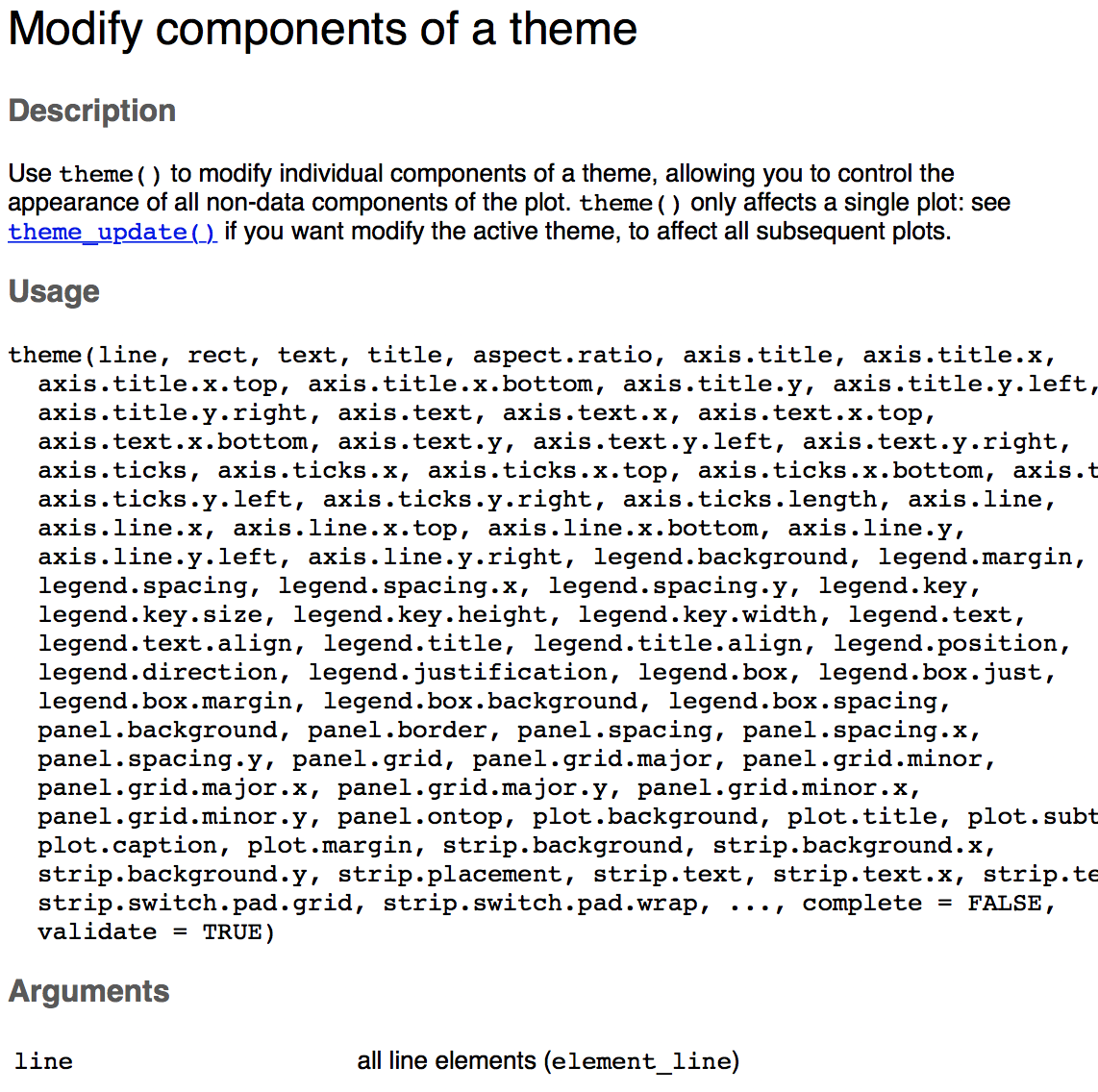
Long list of theme components
See for more info
?themeand- Winston Chang's wiki on github
Pre-made themes
- ggplot has 7 themes in-built, try them out yourself:
p3 + theme_bw()
p3 + theme_gray()
p3 + theme_classic()
p3 + theme_light()
p3 + theme_linedraw()
p3 + theme_minimal()
p3 + theme_void()

Nice pre-made themes from external packages:
ggthemes by Jeffrey Arnold
- https://github.com/jrnold/ggthemes
- ggthemes vignette
- install.packages("ggthemes")
ggtech by Ricardo Bion
- https://github.com/ricardo-bion/ggtech
- devtools::install_github("ricardo-bion/ggtech", dependencies=TRUE)
- ggtech offers themes that resemble google, airbnb, twitter, facebook
- You need to install various necessary fonts manually before using ggtech!
ggthemes examples

Your turn...
Exercise 5: Labels, legends, and themes
- What does
labs()do? Read the documentation. - Create a ggplot (anyone you like) and explore the different built-in themes. You can also install the ggthemes package and choose one of those.
Multiple plots on one page
Arrange multiple plots on the same page
- For ggplot objects the standard R functions
par()andlayout()do not work - Alternative functions:
- All these function use internally the following grid specifications (in "npc" units):

Arrange multiple plots on the same page
- For ggplot objects the standard R functions
par()andlayout()do not work - Alternative functions:
- All these function use internally the following grid specifications (in "npc" units):
- Each approach will be demonstrated using 3 different plots from the
hydrodataset:- a: barplot showing the number of samplings per month
- b: scatterplot showing the temperature ~ salinity relationship
- c: monthly maps of temperature conditions
Demo plots, each assigned to an object
a <- hydro %>%
  select(fmonth, station, cruise, date_time) %>%
  distinct()  %>% group_by(fmonth) %>%
  ggplot(aes(x = fmonth)) +
    geom_bar(aes(fill = fmonth)) +
    guides(fill = "none") +
    scale_fill_brewer(palette = "Paired")

b <- ggplot(hydro, aes(x = psal, y = temp, col = day)) +
  geom_point()

c <- hydro %>%
  filter(pres %in% c(1, 50), fmonth %in% 5:8) %>%
  ggplot(aes(long,lat))+
    geom_point(aes(colour = temp)) +
    scale_colour_gradient(low = "white", high = "red") +
    facet_grid(. ~ fmonth)
Creating subplots with viewport()
To have a small subplot embedded drawn on top of the main plot
- first plot the main plot,
- then draw the subplot in a smaller viewport using also the
print()function
The viewport() function, has as arguments x, y, width and height to control the position and size of the viewport.
library(grid)
# specify the viewport for the subplot
subvp <- viewport(x = 0.7, y = 0.8,
  width = 0.3, height = 0.3)
b
print(a, vp = subvp)

Arrange multiple plots with grid.arrange()
grid.arrange()set up a so-called gtable layout to place multiple grobs on a page in the current device.- Takes for the grid layout number of rows and columns as arguments:
library(gridExtra)
grid.arrange(a, b, c,
  nrow = 2, ncol = 2)

grid.arrange() with arrangeGrob()
- To change the row or column span of a plot, use the function
arrangeGrob()when listing the plotting objects. This function takes also the row or column number as input:
grid.arrange(
  arrangeGrob(a, b, ncol = 2),
  # a and b will be in the 1st row,
  # splitted into 2 columns
  c, # c will be in the 2nd row
  nrow = 2
  )

grid.arrange() with argument layout_matrix
- It is possible to use the
layout_matrixargument for changing the row or column span of a plot (more flexible thanarrangeGrob()):
grid.arrange(a, b, c,
  nrow = 2, ncol = 2,
  layout_matrix = matrix(
    c(1,2,2,3,3,3),
    nrow = 2, byrow = TRUE))
6 grid cells are specified in the matrix
- plot a gets cell 1 (1st row/col)
- plot b gets 2 cells (row 1, col 2-3)
- plot c gets 3 cells (row 2, col 1-3)

Graphics with the cowplot package
- provides a publication-ready theme for ggplot2
- has its own built-in default theme: white background and no grid (similar to
theme_classic()), different font sizes plot_grid()is a shortcut function with limited adjustments
library(cowplot)
plot_grid(a,b,c, labels = c("a)", "b)", "c)"), ncol = 3)

Graphics with the cowplot package
For more adjustments (location and size) use in combination:
ggdraw()→ initializes an empty drawing canvasdraw_plot()→ places a single plot onto the canvasdraw_plot_label()→ adds labels to the plots (default is upper left corner)
abc <- ggdraw() +
  draw_plot(a, x = 0, y = .5, width = .5, height = .5) +
  draw_plot(b, x = .5, y = .5, width = .5, height = .5) +
  draw_plot(c, x = 0, y = 0, width = 1, height = .5) +
  draw_plot_label(label = c("a)", "b)", "c)"),
    x = c(0, 0.5, 0), y = c(1, 1, 0.5), size = 15)
abc

Saving cowplots
- Recall:
ggsave()(in ggplot2) can be used to save ggplots as pdf. - A better solution for cowplots:
save_plot()(in cowplot) → grid layout can be specified so that the output pdf is nicely formatted and scaled
save_plot("abc3.pdf", abc,
  base_aspect_ratio = 1.3, # this makes room for a figure legend
  # the grid specification adjusts the scales:
  ncol = 2,  nrow = 2 )
Coming back to the overall aim...
Explore spatial patterns of summer sea surface temperature in the Baltic Sea graphically:
How to get from left to right?
Your turn...
Exercise 6: Synthesis
You should be able to produce the right hand side plot now.
If you don't know how, follow these steps
- Modify the colour scale.
- Modify the text of the legend title
- Facet into different months instead of using the shape aesthetic.
- Add a title and axes labels.
- Choose a theme.
- Change the panel background colour.
- Modify the colour of the legend title
- CHALLENGE: Add the map to the plot. BUT: Reconsider the order of layers in the plat!
How do you feel now.....?
Totally confused?

Try to reproduce some of the plots in this presentation and the quiz and read chapter 3 on data visualization in 'R for Data Science' or the book ggplot2: Elegant Graphics for Data Analysis by H. Wickham.
Totally bored?

Then figure out how to do an interpolation plot of the thermal regime along the latitude/longitude gradient.
Totally content?
Then go grab a coffee, lean back and enjoy the rest of the day...!

Thank You
For more information contact me: saskia.otto@uni-hamburg.de
http://www.researchgate.net/profile/Saskia_Otto
http://www.github.com/saskiaotto

This work is licensed under a
Creative Commons Attribution-ShareAlike 4.0 International License except for the
borrowed and mentioned with proper source: statements.
Image on title and end slide: Section of an infrared satallite image showing the Larsen C
ice shelf on the Antarctic
Peninsula - USGS/NASA Landsat:
A Crack of Light in the Polar Dark, Landsat 8 - TIRS, June 17, 2017
(under CC0 license)
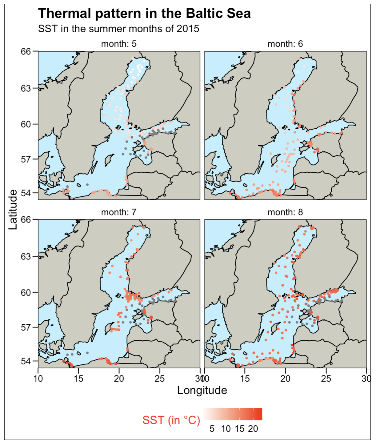
Solution - Exercise 6
This is how you could code the temperature regime plot
world <- map_data("world")
worldmap <- ggplot(world, aes(x = long, y = lat)) +
  geom_polygon(aes(group = group), fill = "ivory3", colour = "black")
baltic <- worldmap + coord_map("ortho",  xlim = c(10, 30), ylim = c(54,66))

baltic + geom_point(data = sst_sum, aes(x = long, y = lat, colour = temp), size = 1) +
  scale_colour_gradient(low = "white", high = "red") +
  guides(colour = guide_colourbar(title = "SST (in °C)")) +
  facet_wrap(~fmonth, labeller = label_both) +
  ggtitle(label = "Thermal pattern in the Baltic Sea",
    subtitle = "SST in the summer months of 2015") +
    xlab("Longitude") + ylab("Latitude") +
  ggthemes::theme_base() +
  theme(legend.position = "bottom", legend.title.align = 1,
    legend.title = element_text(colour = "red", angle = 0),
      panel.background = element_rect(fill = "lightblue1")
  )