Data Analysis with R
8 - Intro2Visualization - Part 1
Saskia A. Otto
Postdoctoral Researcher
Recap ...
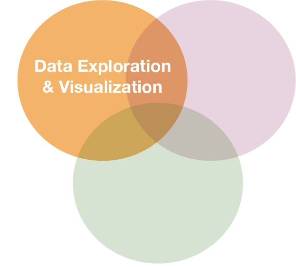
Visualization is one of the corner stones of data science
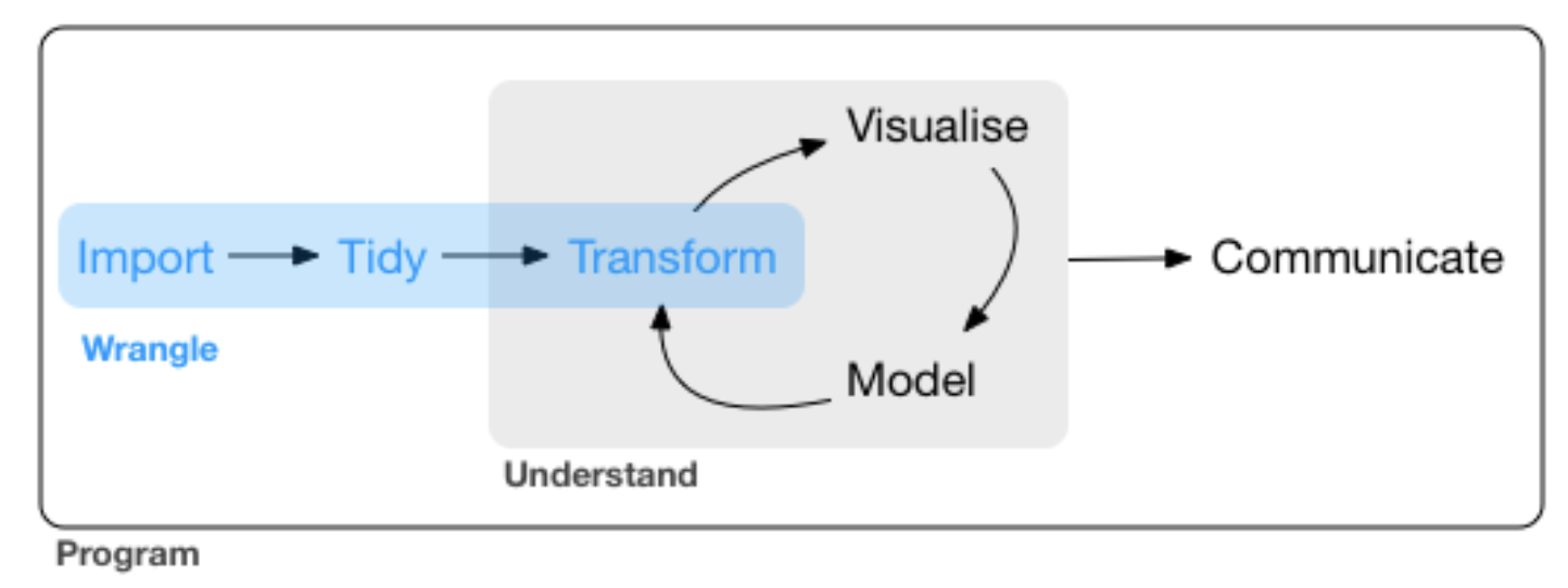
source: R for Data Science by Wickam & Grolemund, 2017 (licensed under CC-BY-NC-ND 3.0 US)
p
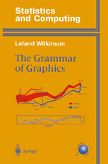
Visualization with ggplot2
A system for creating graphics
- Based on "The Grammar of Graphics"
- The fundament for plotting in R nowadays
- Well documented
- http://ggplot2.tidyverse.org
- http://ggplot2.org
- complete book (online version)
- Getting help: ggplot2 mailing list
- An increasing number of ggplot2 extensions developed by R users in the community
Creating plots in a stepwise process
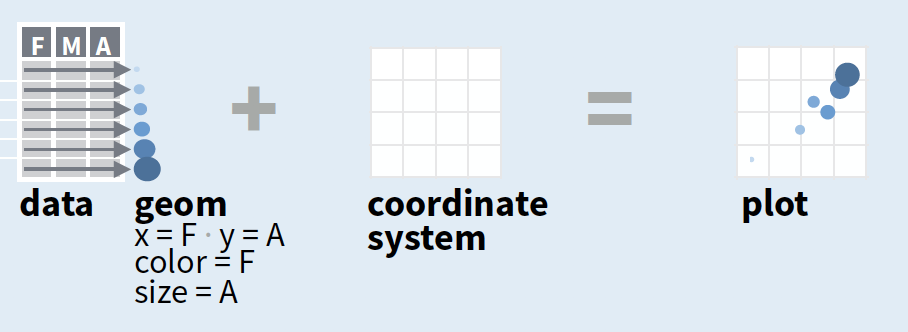
- Start with
ggplot(data, mapping = aes())where you supply a dataset and (default) aesthetic mapping - Add a layer by calling a
geom_function - Then add on (not required as defaults supplied)
- scales like
xlim() - faceting like
facet_wrap() - coordinate systems like
coord_flip() - themes like
theme_bw()
- scales like
- Save a plot to disk with
ggsave()
source of image (topright): older version of Data Visualization with ggplot cheat sheet (licensed under CC-BY-SA)
Creating plots in a stepwise process
- Start with
ggplot(data, mapping = aes())where you supply a dataset and (default) aesthetic mapping - Add a layer by calling a
geom_function - Then add on (not required as defaults supplied)
- scales like
xlim() - faceting like
facet_wrap() - coordinate systems like
coord_flip() - themes like
theme_bw()
- scales like
- Save a plot to disk with
ggsave()
aesthetic mapping:
to display values, variables in the data need to be mapped to visual properties of the geom (aesthetics) like size, color, and x and y locations. aes() mappings within ggplot() represent default settings for all layers (typically x and y), otherwise map variables within geom-functions.
Creating plots in a stepwise process
- Start with
ggplot(data, mapping = aes())where you supply a dataset and (default) aesthetic mapping - Add a layer by calling a
geom_function - Then add on (not required as defaults supplied)
- scales like
xlim() - faceting like
facet_wrap() - coordinate systems like
coord_flip() - themes like
theme_bw()
- scales like
- Save a plot to disk with
ggsave()
geom_function:
combines a geometric object representing the observations with aesthetic mapping, a stat, and a position adjustment, e.g., geom_point() or geom_histogram()
Creating plots in a stepwise process
- Start with
ggplot(data, mapping = aes())where you supply a dataset and (default) aesthetic mapping - Add a layer by calling a
geom_function - Then add on (not required as defaults supplied)
- scales like
xlim() - faceting like
facet_wrap() - coordinate systems like
coord_flip() - themes like
theme_bw()
- scales like
- Save a plot to disk with
ggsave()
scales:
control the details of how data values are translated to visual properties (override the default scales)
Creating plots in a stepwise process
- Start with
ggplot(data, mapping = aes())where you supply a dataset and (default) aesthetic mapping - Add a layer by calling a
geom_function - Then add on (not required as defaults supplied)
- scales like
xlim() - faceting like
facet_wrap() - coordinate systems like
coord_flip() - themes like
theme_bw()
- scales like
- Save a plot to disk with
ggsave()
facetting:
smaller plots that display different subsets of the data; also useful for exploring conditional relationships.
Creating plots in a stepwise process
- Start with
ggplot(data, mapping = aes())where you supply a dataset and (default) aesthetic mapping - Add a layer by calling a
geom_function - Then add on (not required as defaults supplied)
- scales like
xlim() - faceting like
facet_wrap() - coordinate systems like
coord_flip() - themes like
theme_bw()
- scales like
- Save a plot to disk with
ggsave()
coordinate system:
determines how the x and y aesthetics combine to position elements in the plot
Creating plots in a stepwise process
- Start with
ggplot(data, mapping = aes())where you supply a dataset and (default) aesthetic mapping - Add a layer by calling a
geom_function - Then add on (not required as defaults supplied)
- scales like
xlim() - faceting like
facet_wrap() - coordinate systems like
coord_flip() - themes like
theme_bw()
- scales like
- Save a plot to disk with
ggsave()
themes:
control the display of all non-data elements of the plot. You can override all settings with a complete theme like theme_bw(), or choose to tweak individual settings
Creating plots in a stepwise process
- Start with
ggplot(data, mapping = aes())where you supply a dataset and (default) aesthetic mapping - Add a layer by calling a
geom_function - Then add on (not required as defaults supplied)
- scales like
xlim() - faceting like
facet_wrap() - coordinate systems like
coord_flip() - themes like
theme_bw()
- scales like
- Save a plot to disk with
ggsave()
ggsave("plot.png", width = 5, height = 5):
Saves last plot as 5’ x 5’ file named "plot.png" in working directory. Matches file type to file extension.
A demonstration with the internal iris data
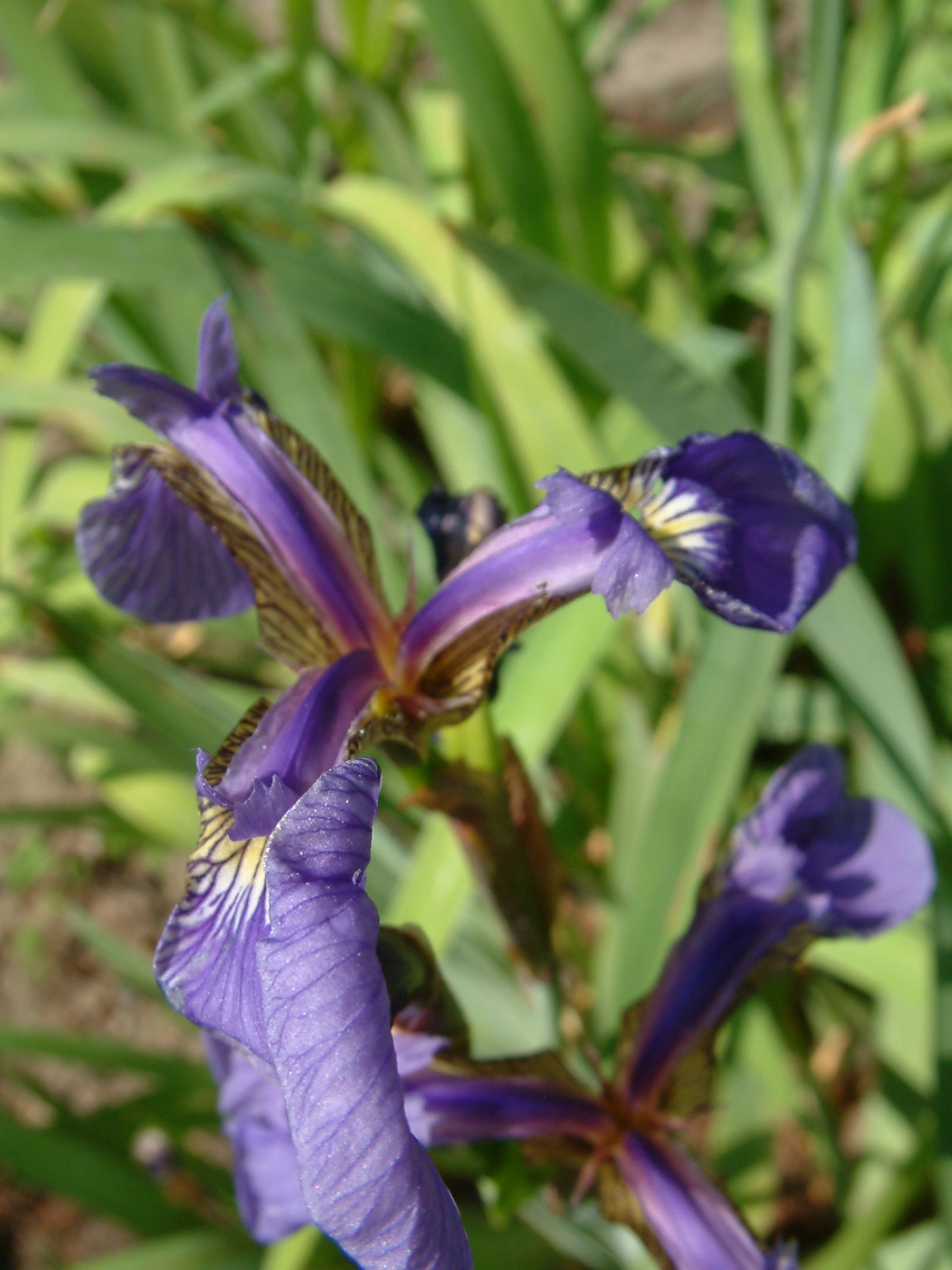
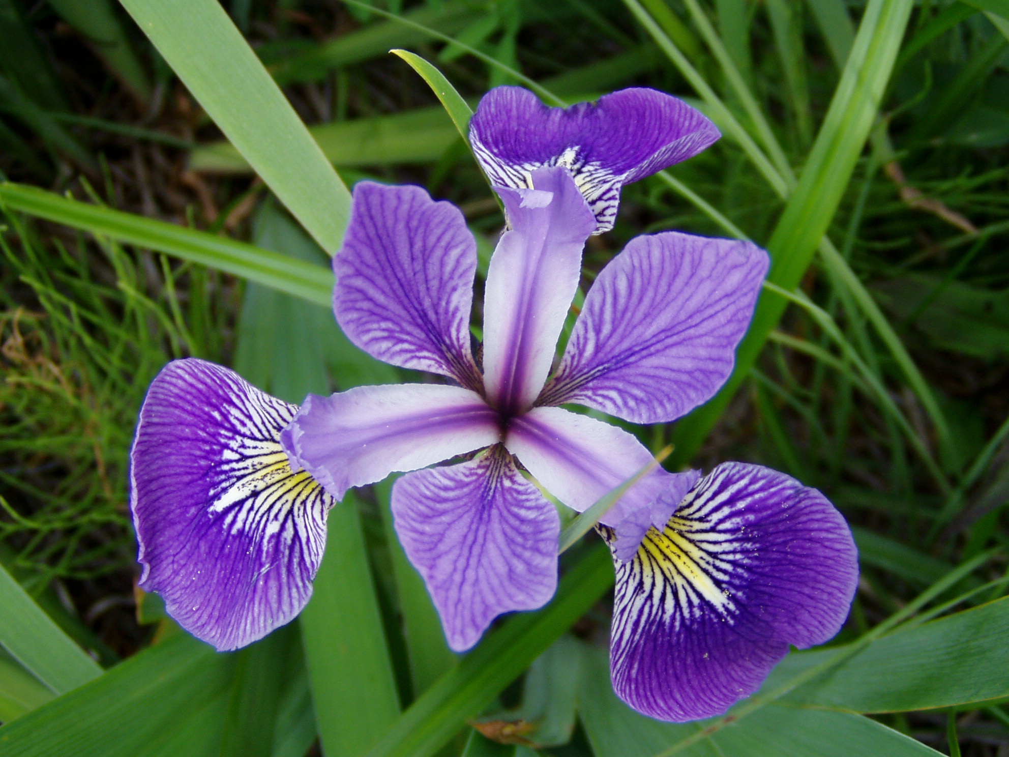
Photos taken by Radomil Binek, Danielle Langlois, and Frank Mayfield (from left to right); accessed via Wikipedia (all photos under CC-BY-SA 3.0 license)
Step 1 - start a plot with ggplot()
ggplot(iris, aes(x = Sepal.Length,
    y = Petal.Length))

Step 2 - add layers: geom_point()
ggplot(iris, aes(x = Sepal.Length,
    y = Petal.Length)) +
  geom_point()

Step 2 - add layers: geom_point()
ggplot(iris, aes(x = Sepal.Length,
    y = Petal.Length)) +
  geom_point(aes(col = Species))
aes(col = Species)
Show points in species-specific colours.
Step 2 - add layers: geom_smooth()
ggplot(iris, aes(x = Sepal.Length,
    y = Petal.Length)) +
  geom_point(aes(col = Species)) +
  geom_smooth()

Step 2 - add layers: geom_smooth()
ggplot(iris, aes(x = Sepal.Length,
    y = Petal.Length)) +
  geom_point(aes(col = Species)) +
  geom_smooth(aes(col = Species),
    method = "lm")
aes(col = Species), method = "lm"
Make smoother species-specific and linear.
Step 2 - add layers
ggplot(iris, aes(x = Sepal.Length,
    y = Petal.Length, col = Species)) +
  geom_point() +
  geom_smooth(method = "lm")
ggplot() (so it becomes the default setting for all added layers).
Step 3 - add scales: scale_colour_brewer()
ggplot(iris, aes(x = Sepal.Length,
    y = Petal.Length, col = Species)) +
  geom_point() +
  geom_smooth(method = "lm") +
  scale_colour_brewer()

Step 4 - add facets: facet_wrap()
ggplot(iris, aes(x = Sepal.Length,
    y = Petal.Length, col = Species)) +
  geom_point() +
  geom_smooth(method = "lm") +
  scale_colour_brewer() +
  facet_wrap(~Species, nrow=3)
facet_wrap(~Species, nrow=3)
Divide the species-specific observations into different panels.
Step 5 - modify coordinate system: coord_polar()
ggplot(iris, aes(x = Sepal.Length,
    y = Petal.Length, col = Species)) +
  geom_point() +
  geom_smooth(method = "lm") +
  scale_colour_brewer() +
  facet_wrap(~Species, nrow=3) +
  coord_polar()

Step 6 - change the look of non-data elements: theme_dark()
ggplot(iris, aes(x = Sepal.Length,
    y = Petal.Length, col = Species)) +
  geom_point() +
  geom_smooth(method = "lm") +
  scale_colour_brewer() +
  facet_wrap(~Species, nrow=3) +
  coord_polar() +
  theme_dark()

Step 7 - save the plot: ggsave()
ggplot(iris, aes(x = Sepal.Length,
    y = Petal.Length, col = Species)) +
  geom_point() +
  geom_smooth(method = "lm") +
  scale_colour_brewer() +
  facet_wrap(~Species, nrow=3) +
  coord_polar()

ggsave("Iris_length_relationships.pdf", width = 4, height = 4)
The last plot displayed is saved (as default).
ggplot - geom_functions
When to use which function?
That depends on
- what you want to display (your question)
- and the type of data
Common plots are ...
Visualize frequency distributions
BARPLOTS -
are used for categorical or discrete variables. Bars do not touch each other; there are no ‘in-between’ values.

HISTOGRAMS and DENSITY PLOTS (can be combined) are used for continuous variables and are often used to check whether variables are normally distributed. Bars touch each other in histograms.

Compare groups
BOXPLOTS - are used to compare two or more groups in terms of their distributional center and spread. They transport a lot of information and should be computed in every data exploration! You can check,
- differences in average y values between groups and whether these might be significant,
- if group variances differ,
- whether individual groups are normally distributed
- identify outlier

Show relationship between 2 variables
SCATTERPLOTS -
are the most basic plots for continuous variables. They are also the least interpreting plots as they show every observation in the 2-dimensional space.

Another useful feature is that they can be combined with other plotting elements: defining aesthetics for a 3rd variable (e.g. colours of points) or adding regression or smoothing lines to help visualise the relationship:

An overview of core geom_functions depending on the type of data:
Elements taken from older version of ggplot cheat sheet
Some examples with the ICES hydro data
A barplot to see the frequency of monthly samplings
hydro_sub <- hydro %>%
 select(fmonth, station, date_time) %>%
  # (fmonth = month as factor)
 distinct()

ggplot(hydro_sub,aes(x=fmonth)) +
  geom_bar()
Note
For barplots (or boxplots) x must be categorical, hence, we use here month as a factor!
A scatterplot to see all stations, coloured by month
Note:
To get a discrete scale we use again fmonth.hydro_sub <- hydro %>%
select(fmonth,station,lat,long) %>%
distinct()
ggplot(hydro_sub, aes(x = long,
y = lat, col = fmonth)) +
geom_point()

A histogram to see the distribution of (all) temperature values
Note:
You can use the pipe operator also when plotting and saving ggplot as an object!p <- hydro %>% ggplot(aes(x = temp)) +
geom_histogram()
p

A boxplot to compare the surface temp between months
hydro %>% filter(pres < 5) %>%
  group_by(fmonth, station, date_time, cruise) %>%
  summarise(mean_sst = mean(temp)) %>% ungroup() %>%
ggplot(aes(x = fmonth, y = mean_sst)) +
  geom_boxplot(outlier.colour = "red", outlier.alpha = 0.2)

Correlation plot between temperature and salinity
ggplot(hydro, aes(x = psal, y = temp, col = day)) +
  geom_point()

.. now separated by month
ggplot(hydro,
  aes(x = psal,
    y = temp,
    col = day)) +
  geom_point() +
  facet_wrap(
    ~fmonth,
    nrow = 3)

Depth profile at one station in July
hydro_sub <- hydro %>%
  filter(station=="0403",fmonth==7,day==11)
p_temp <- ggplot(hydro_sub, aes(y=pres)) +
  geom_point(aes(x = temp), col="red") +
  ylim(70, 0)
p_sal <- ggplot(hydro_sub, aes(y=pres)) +
  geom_point(aes(x = psal)) +
  ylim(70, 0)
p_oxy <- ggplot(hydro_sub, aes(y=pres)) +
  geom_point(aes(x = doxy), col="blue") +
  ylim(70, 0)
gridExtra::grid.arrange(grobs = list(
  p_temp, p_sal, p_oxy), nrow=1)
Note
The colour specification is outside the aesthetic mapping: because we want the same colour for all observations.
Some extension examples: ggridges
library(ggridges)
hydro %>% filter(pres < 10) %>%
  group_by(station, fmonth, day) %>%
  summarise(
    sst = mean(temp, na.rm = TRUE)) %>%
  group_by(station, fmonth) %>%
  summarise(
    sst = mean(sst, na.rm = TRUE)) %>%
  ungroup() %>%
  ggplot(aes(x = sst, y = fmonth,
    fill = fmonth)) +
  geom_density_ridges(scale = 12,
    rel_min_height = 0.005) +
  scale_fill_cyclical(
    values = c("blue", "green")) +
  theme_ridges()

Some extension examples: ggmap
library(ggmap)
b <- matrix(c(
  min(hydro$long),
  max(hydro$long),
  min(hydro$lat),
  max(hydro$lat) ), byrow=T,nrow=2)
colnames(b) <- c("min","max")
rownames(b) <- c("x","y")
map_bs <- ggmap(get_map(location = b,
  zoom = 5))
map_bs + geom_point(data=hydro,
  aes(long,lat), size=0.5,
  color="red")

Some extension examples: ggmap
baltic <- c(left = min(hydro$long),
            bottom = min(hydro$lat),
            right = max(hydro$long),
            top = max(hydro$lat))
map_stamen <- get_stamenmap(baltic,
  zoom = 5, maptype = "toner-lite")
ggmap(map_stamen) +
  geom_point(data=hydro,
  aes(long,lat), size=0.5,
  color="red") + theme_linedraw()

Your turn...
Quiz 1: Syntax
Complete the following code snippet (fill in the ... gaps) to create the plot you need for answering the question below.
library(ggplot2)

p <- ...(... = mtcars, ...(wt, mpg, label = rownames(mtcars)))
... + geom_point(...(size = gear)) ...
geom_text(...(colour = factor(cyl)), hjust = 0, nudge_... = 0.05)
- Find the car model in the 'mtcars' dataset with the lowest mpg (=Miles per(US) gallon) value in its 4 cyl(inder) class that also has the lowest number of (forward) gears. Which position in the alphabet has the first letter of this model?
You have to fill in 4 times a function name, 2 times a (partial) argument, 1 symbol (which is in fact also a function), and 1 object name.
- 20
Quiz 2: Get to know geom_functions
Which of these function is NOT a geom_function?
- geom_hex
- geom_linerange
- geom_label
- geom_ribbon
- geom_trend
- geom_sf
- geom_crossbar
The webside http://ggplot2.tidyverse.org/reference/ provides an overview of all geom_functions
Small exercises with the ICES hydro dataset
- What happens if you make a scatterplot of station (x) vs temp (y)? Why is the plot not useful? What would be a better plot?
- What happens if you make a boxplot of cruise (x) vs psal (y)? Why is this plot less suitable? What could be an alternative?
How do you feel now.....?
Totally confused?

Try to reproduce some of the plots in this presentation and the quiz and read chapter 3 on data visualization in 'R for Data Science' .
Totally bored?

Then figure out how to get a CTD profile in ONE panel!
Totally content?
Then go grab a coffee, lean back and enjoy the rest of the day...!

Thank You
For more information contact me: saskia.otto@uni-hamburg.de
http://www.researchgate.net/profile/Saskia_Otto
http://www.github.com/saskiaotto

This work is licensed under a
Creative Commons Attribution-ShareAlike 4.0 International License except for the
borrowed and mentioned with proper source: statements.
Image on title and end slide: Section of an infrared satallite image showing the Larsen C
ice shelf on the Antarctic
Peninsula - USGS/NASA Landsat:
A Crack of Light in the Polar Dark, Landsat 8 - TIRS, June 17, 2017
(under CC0 license)